What is the Steam Map?
Traditional game categories like genres and tags don't capture what really makes games similar. The Steam Map is our solution — a model that understands game similarity the way players do.
How It Works
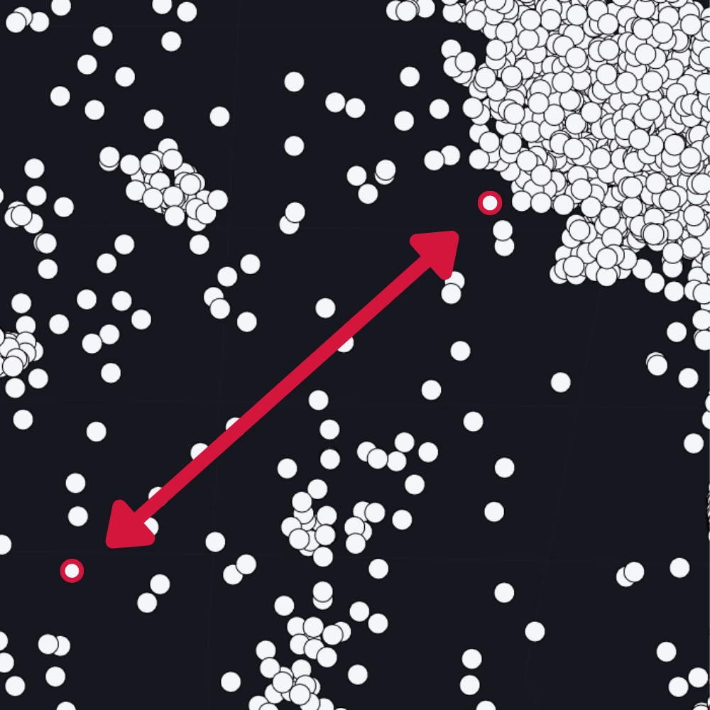
Think of the Steam Map as a massive space where every game has its own position. Games that are similar sit close together, while different games are far apart.
The closer two games are on the map, the more they have in common — whether that's gameplay style, visual aesthetics, or the overall experience they offer players.
Put the Map to Work
Every research tool we build is grounded in the Steam Map's understanding of game similarity. Here's how you can use it.
Search & Analyze
Search for games by name or describe what you're looking for. The model finds the most similar titles and surfaces detailed market insights around them.
Explore & Trend
Navigate interactive heatmaps of the entire marketplace. Spot competitive density at a glance, then dive into current supply and demand trends.
Find the Gaps
Discover underserved market segments where player demand outpaces supply. Pinpoint the gaps where your next game could thrive.
Get the Latest Indie Innovations
We use our Steam Map to celebrate the most unique games on Steam every month. Dive into their marketing strategies and unearth what their success tells us about Steam’s ever-changing landscape.